Samarth eGov - v4.0 Release User Guide
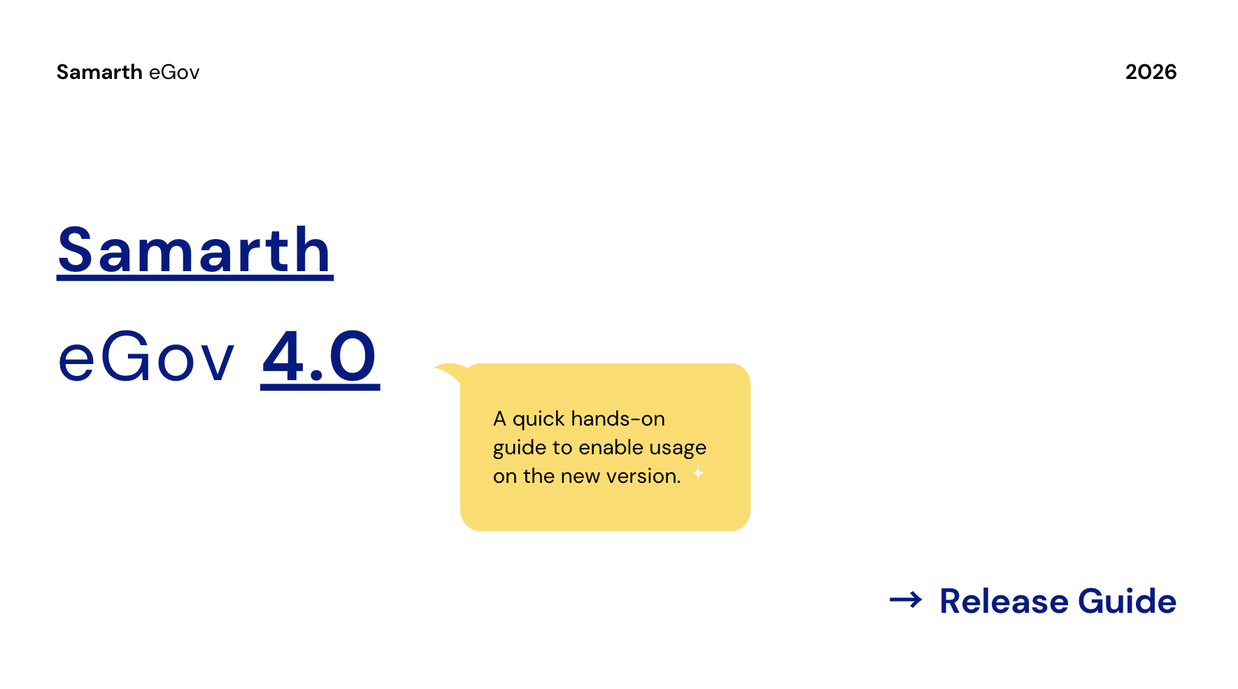
Samarth eGov Suite v4.0 builds on the workflows you already use every day, but focuses on making them faster, more intuitive, and better connected across modules.
This release introduces an integrated guided tour that lets you explore new capabilities directly inside the suite, without relying on external documentation. If you prefer a detailed overview of all features, this guide is for you.
This guide is written for existing Samarth users who are already familiar with all packages and core modules (Base, Academic, Employee, Finance, Governance, etc.) and want a concise overview of what changed, where to find it, and how to get value from it quickly.
1. Overview - What’s New?
Samarth eGov 4.0 focuses on enhanced usability, personalisation, and system awareness.
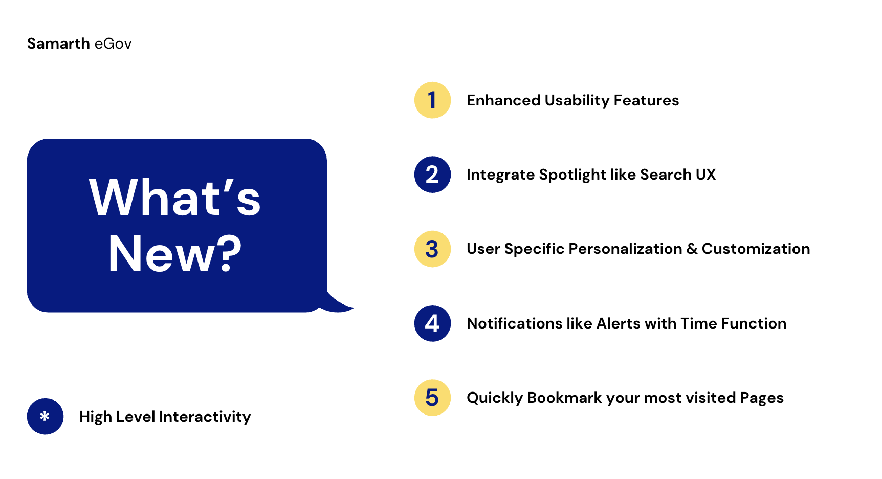
A quick overview of some of the enhancement features is mentioned below:
- Spotlight-like search with bookmarks and recents.
- Deep personalisation (themes, font, layout, etc).
- Quick Bookmarks to visit your most frequently visited pages.
- System feedback and resilience (notifications, alerts, offline, guided tour).
- Enhanced usability primitives (navigation, sidebars, states, errors).
- Branded institutional content on the Login screen and Dashboards.
Please Read Full Guide:
This guide is written for existing Samarth users moving from the current 3.x version to the latest 4.0 version.
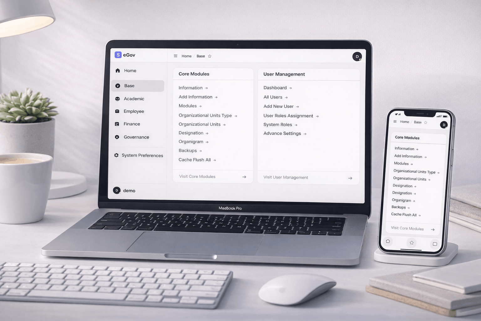
2. Spotlight-like Search, Bookmarks & Recents
Keyboard Shortcut - Alt (or Cmd ⌘) + K

/// Other Keyboard Operations Shortcut within the Search Modal

2. i. Spotlight Search for quick Access
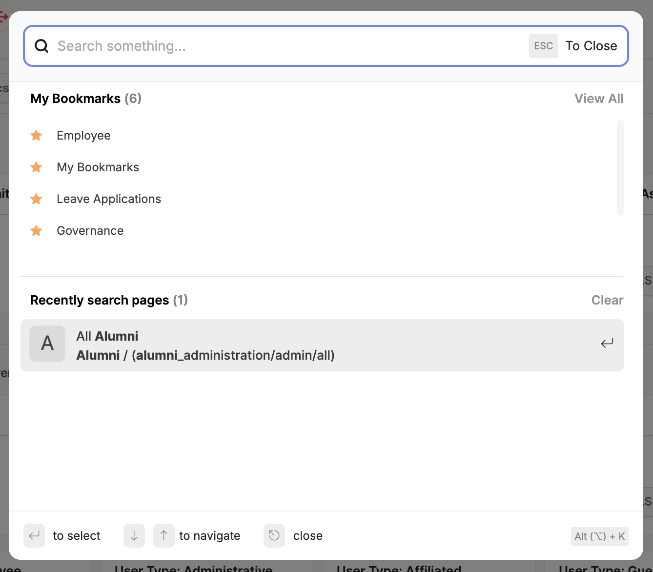
Workflow impact:
- Users can move across Samarth like a command palette instead of drilling into menus and multiple pages to find a single link or desired page.
How it works:
- Press the configured shortcut ( Ctrl / Cmd + K for Windows and Mac, respectively) or click the search icon in the header to open the Quick Search Spotlight overlay.
- Start typing a module, page, or entity name (e.g. “Employee”, “Leave Applications”, “Alumni”).
- Results are grouped, with special sections for:
- My Bookmarks
- Recently searched pages
- Use arrow keys + Enter to open a result; Esc to close.
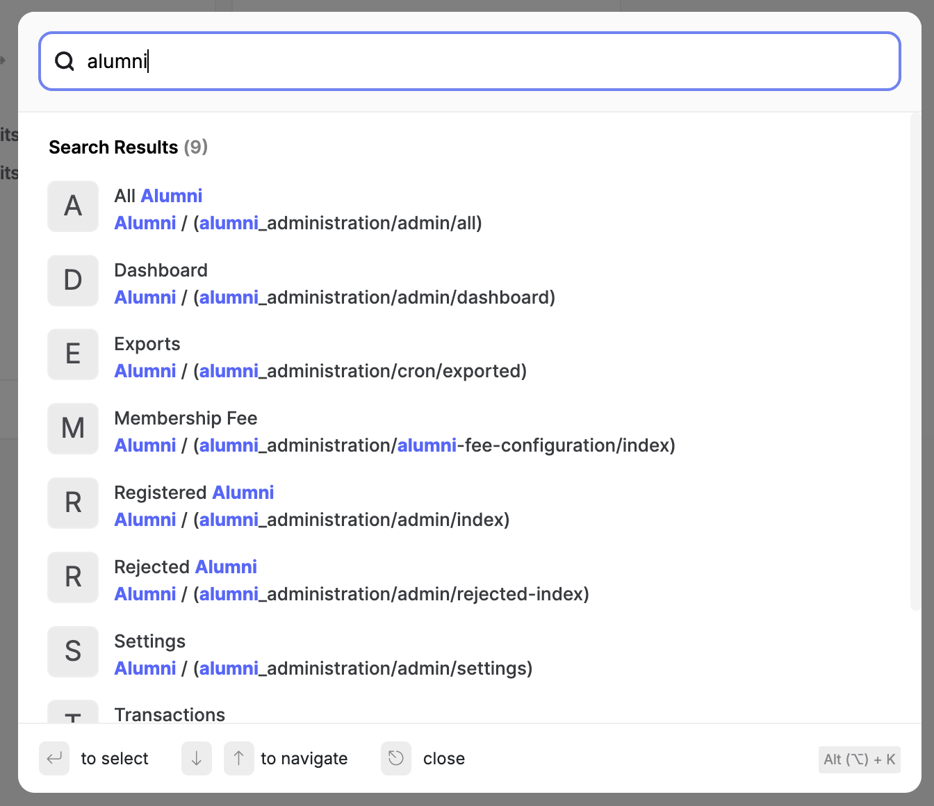
When to use:
- Jumping between modules without touching the sidebar or navigating into modules.
- Revisiting a page you opened recently.
- Discovering lesser-known pages by fuzzy-typing their intent.
- All the links and pages are bound to the role assignment; links will be visible only if the user has access to the individual doctype in the system based on User Role / Permissions Assignments.
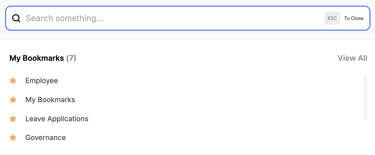
2. ii. Bookmarks: Quick Access to Your Favourites
// Bookmarks within the Spotlight Search Modal for quick access
- during the initial state, without any search being performed in the Search modal.
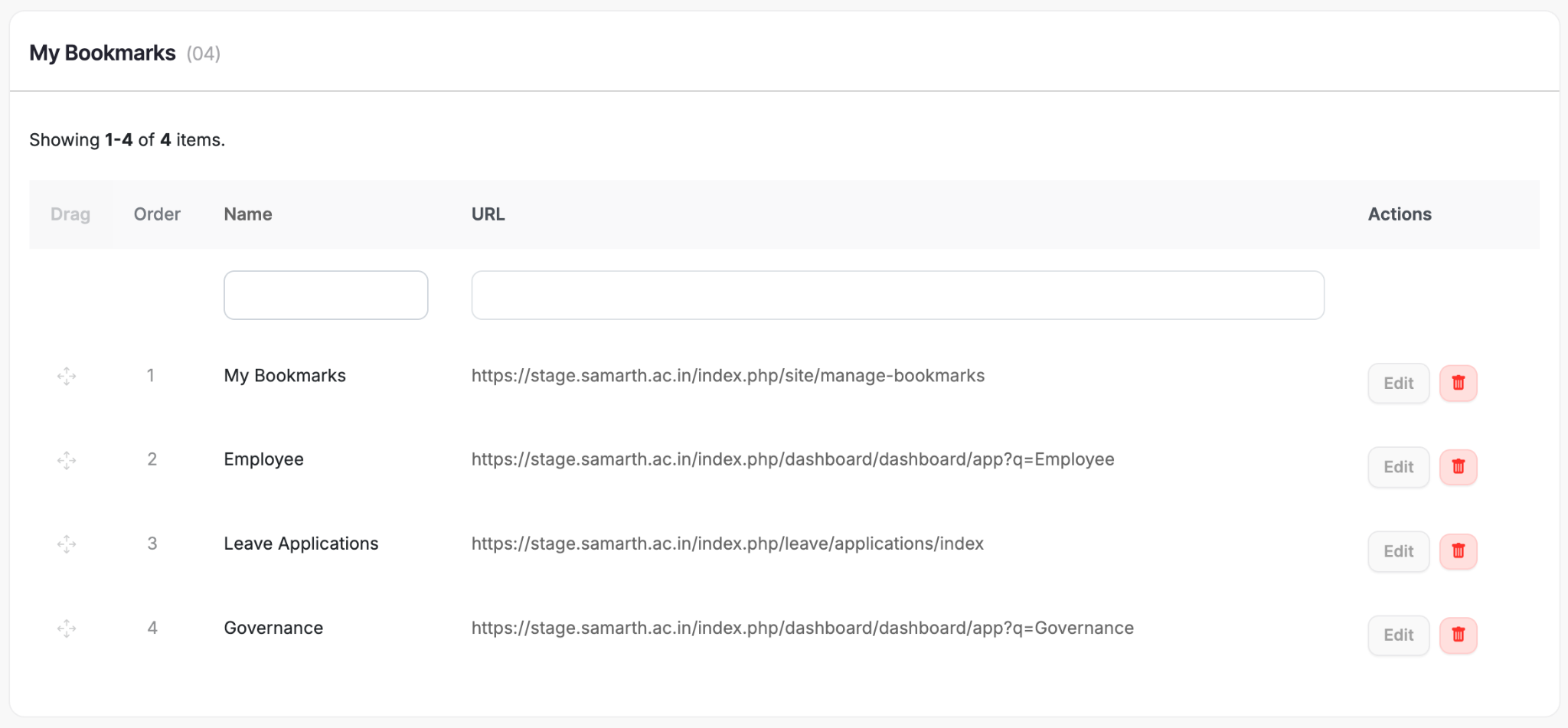
// A Dedicated Bookmarks Page
We’ve basically added a first-class “power user dock.”
Where it appears:
- Inside the search command palette: sections “My Bookmarks” and “Recently searched pages”.
- As a dedicated “My Bookmarks” page with drag-to-reorder.
- As small, quick-access chips (e.g., “Home / Dashboard ★”) in the header after each ending item in the breadcrumb navigation section.
Core behaviours:
- Star/Bookmark from any page (exact pattern depends on your implementation: star icon in header or within page meta).
- An outline star icon (☆) appears by default if the page is not bookmarked, or else a filled star (★) appears if the page is bookmarked.
// Bookmarked Page

// Scenario of a Page that is not Bookmarked

- “My Bookmarks” list shows:
- Sortable order using drag handle.
- Name + URL for each bookmark.
- Reordering is persisted per user.
- The Recent Searches section auto-populates from your usage.
Suggested user narrative:
- Use bookmarks for at most 15 pages you touch very frequently on a daily basis (e.g., “Programme”, “Leave Applications”, “Fee Payments”, etc.).
- Use recent searches when you’re in exploration mode and don’t want to bookmark everything.
3. New Login, Errors & System States
3. i. Brand New Login Screen
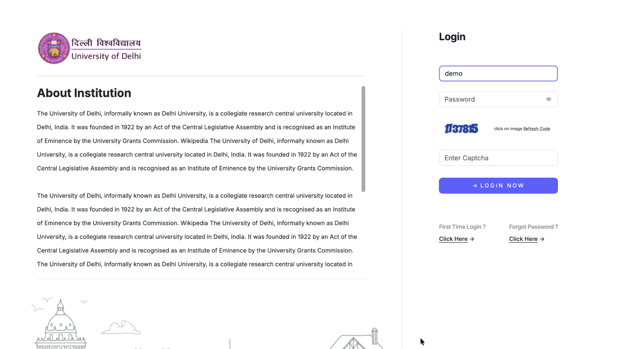
Purpose: Make the entry point feel “owned” by the institution and future-ready.
Key elements:
- Left pane: “About Institution” with rich copy for context.
- Right pane: login form (username, password, etc.).
- Branding Block:
- Tagline about a future-ready digital campus.
- Clear data-ownership line (“Data owned by University Name”).
- Buttons to read docs and visit the main site.
- University Content Blocks:
- Separate link columns to add various important links of the University like University website, bulletin board, anti-ragging committee support, information magazines, etc.
For existing users:
- For some, existing content blocks set on login page will stay intact if added.
- Functionally similar login, but more trustworthy and “enterprise product-grade.”
- Use the docs/website buttons to self-serve info without leaving the login surface.
3. ii. Purposeful Error Pages
We’ve upgraded errors from “dead-end” to navigable hubs.
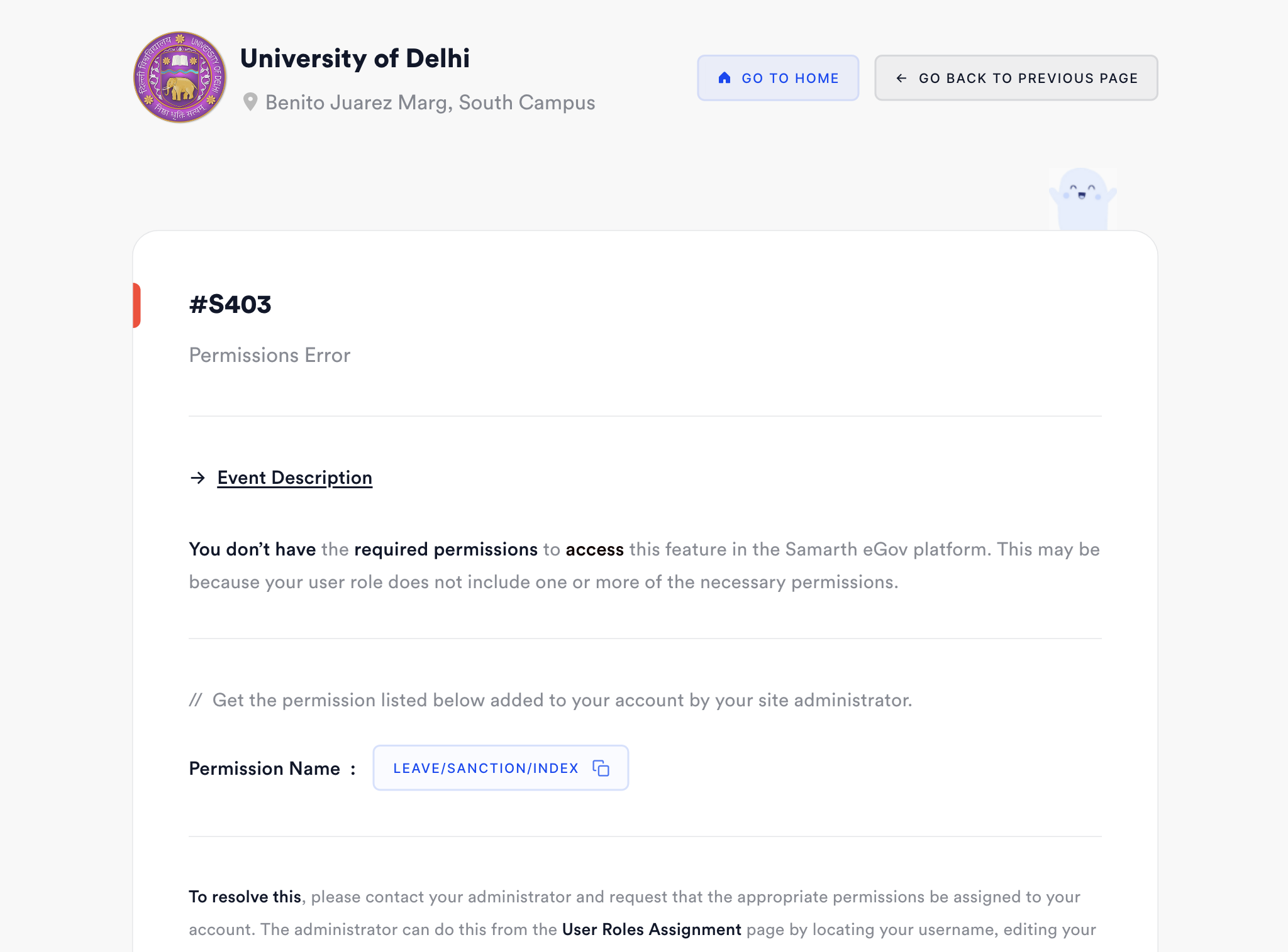
Example: Permissions Error S403.
What’s new:
- Human-readable error title, code (e.g. #S403) and permission name (e.g. LEAVE/SANCTION/INDEX).
- Clear guidance: “Contact your administrator and share this permission code.”
- Handy UX touch: Copy function on the permission code to share right away with your administrator.
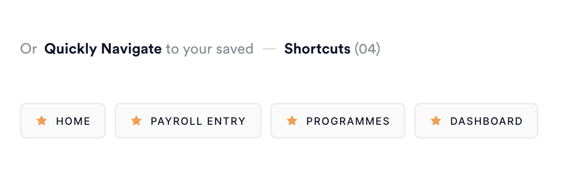
- Quick navigation:
Quick access to your shortcuts (Home, Payroll Entry, Programmes, Dashboard) on error pages as well, for quick navigation and reference at the bottom of the page, right above the footer.
For users:
- If you land on a permission error:
- Copy the permission code and share it with admin/support.
- Use shortcuts to continue productive work instead of getting stuck.
4. Navigation, Sidebars & App Menus
4. i. Collapsible & Resizable Sidebars
Keyboard Shortcut - Alt (or Cmd ⌘) + ;
/// Resize Handle Bars - use drag function on sidebar’s end border to resize the width of the sidebar
/// Resized Sidebar - using resize handlebars on the right border of the left sidebar
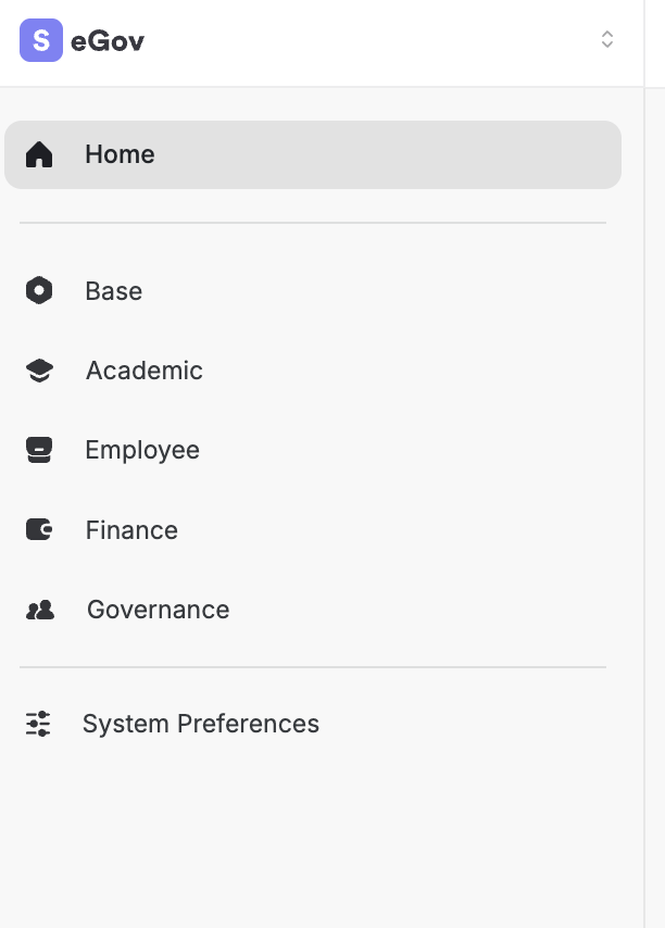
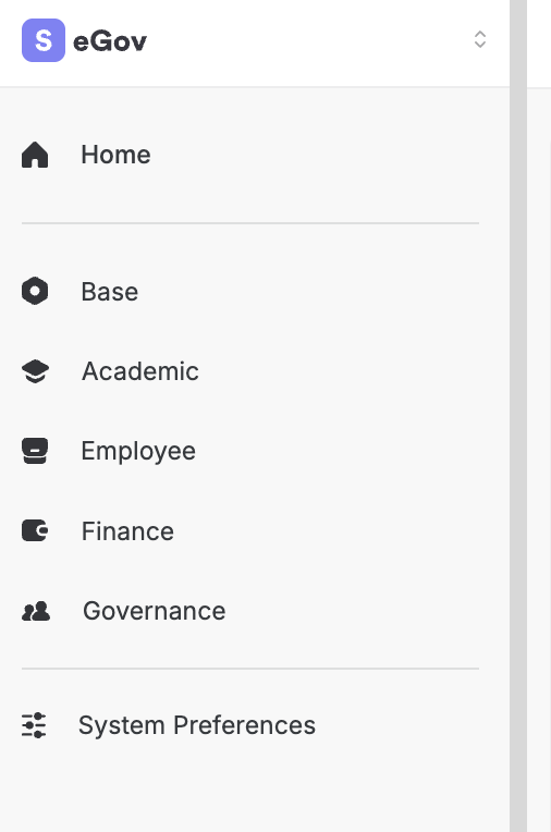
/// Expanded Sidebar - Shown by default to all users
/// Collapsed Sidebar - Activated by clicking on toggle sidebar button, link or shortcut
Objective: Give control over screen real estate.
Behaviours:
- Collapse sidebar to maximise space on the page for full-width content.
- Expand for full labels when hovering near the left end of the screen.
- Resize:
- Drag the vertical boundary to adjust the width.
- Single-click to toggle, double-click to reset to default.
- State awareness:
- Sidebar width and state are remembered per user and per page.
Impact:
- Heavy data pages (tables, dashboards) feel breathable.
- Users with small screens still get a pro-grade layout.
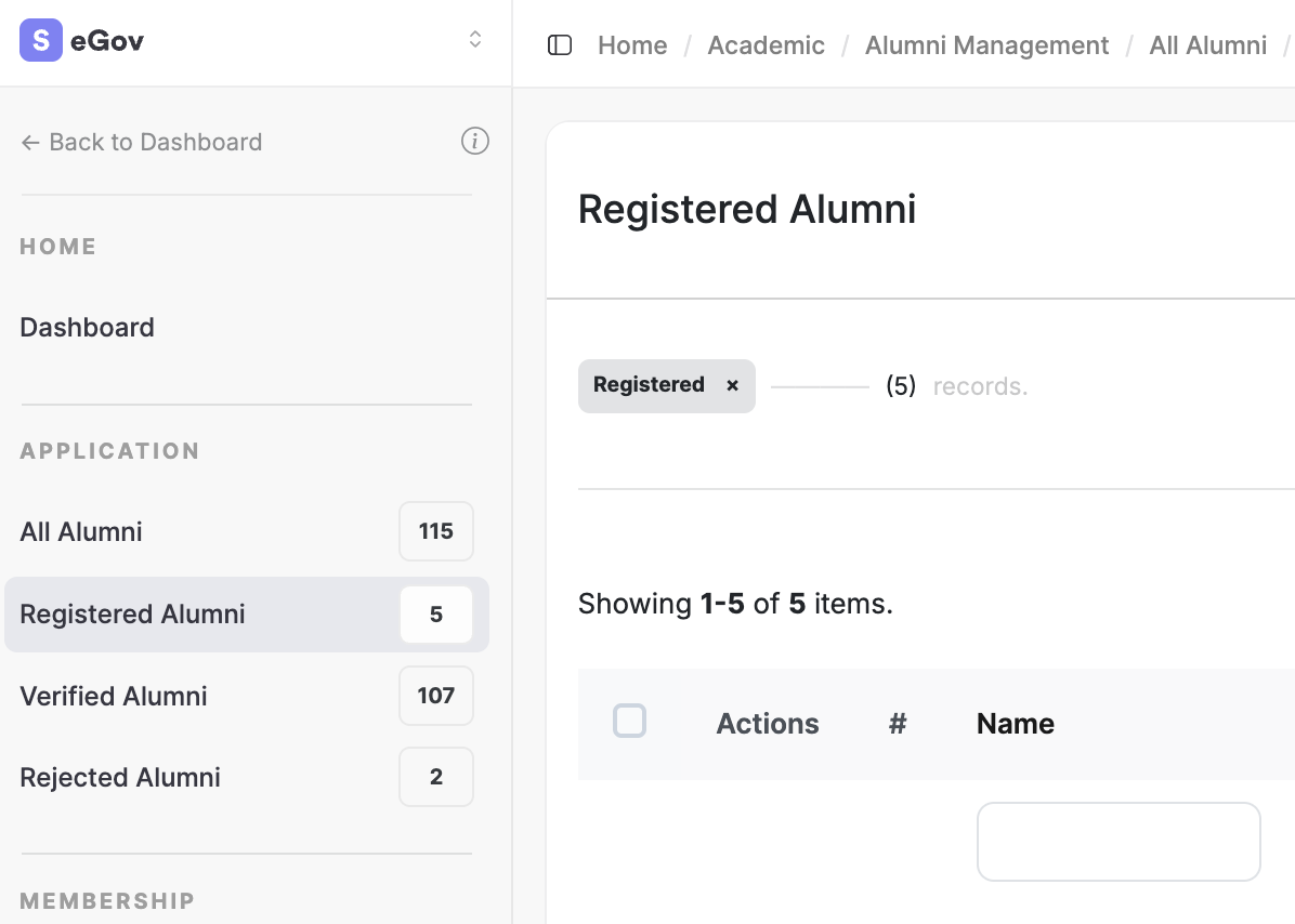
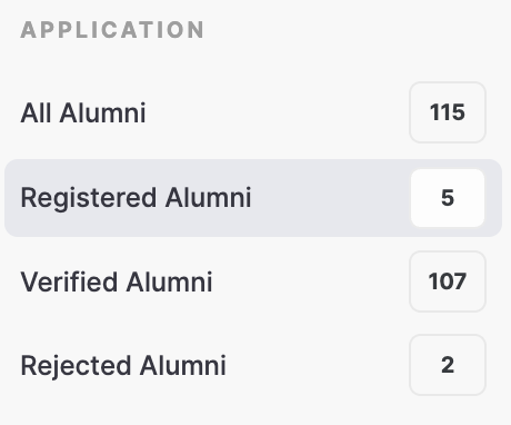
4. ii. App-specific Grouped Menus with Counts Status
/// Counts to quickly navigate through the entire module straight away from the sidebar
This is your “information architecture meets telemetry”.
What users see:
- A contextual sidebar when inside an app (e.g. Alumni).
- Grouped sections like:
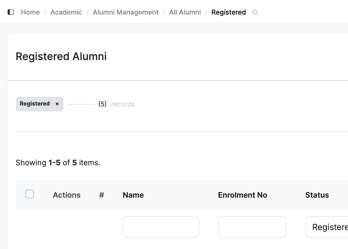
- APPLICATION → All Alumni (115), Registered (5), Verified (107), Rejected (2).
- Active state clearly highlighted (e.g. “Verified Alumni”).
- Alternate simplified view for less detailed mode.
Value:
- Users read the app’s state at a glance.
- They can jump to the relevant subset instead of filtering manually and then can continue the further filtration based on the user’s requirements.
- Also, click on the section headers for each menu section in left sidebar to collapse the entire section to quickly see another sections in the left sidebar menu.
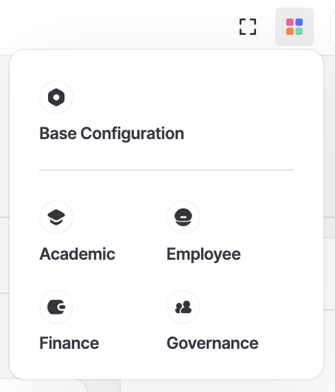
4. iii. Package Switcher (Module Group Switcher)
Keyboard Shortcut - Alt (or Cmd ⌘) + P
/// Inactive / Non-clicked State of the Package Switcher Menu

/// Clciked & Opened State of Package Switcher
/// Hover State on any of the Packages
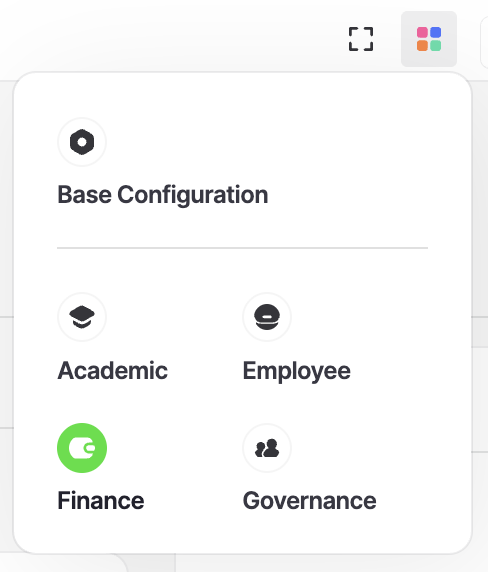
Think of it as a global app launcher.
Usage:
- Click the modules grid icon (or similar) to open the switcher.
- See grouped module clusters: Academic, Employee, Finance, Governance, etc.
- One click to jump to a module, from anywhere.
Best for:
- Cross-functional users (registrar, exam, admin, finance) who hop across various packages all day.
- Reducing going to home and then having sidebar-dependence for deep navigation across various module groups.
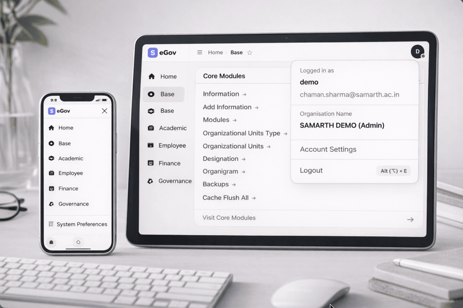
4. iv. Quick Account Switcher (Multi-tenant)
/// Current Administrative Account of the User
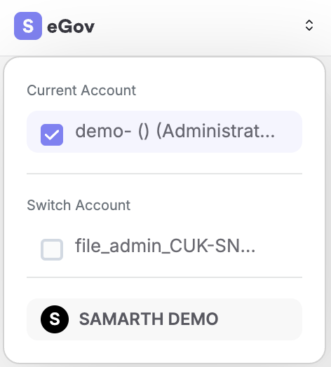
/// Switched to the Employee Account type of the User
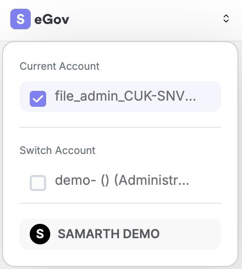
For multi-tenant account type setups.
Interface:
- Shows “Current Account” (checked).
- Shows other available accounts/institutions under “Switch Account”.
- Minimal variant for users with fewer accounts.
Behaviours:
- Switch accounts quickly without navigating through multiple screens.
- Clear visual distinction between current and other accounts.
User mental model:
- Treat each account as a “workspace” with its own context.
- The system keeps you oriented by clearly naming the current account.
5. Personalisation, Themes & Responsive Layout
5. i. System Preferences: Themes & Typography
Keyboard Shortcut - Alt (or Cmd ⌘) + S
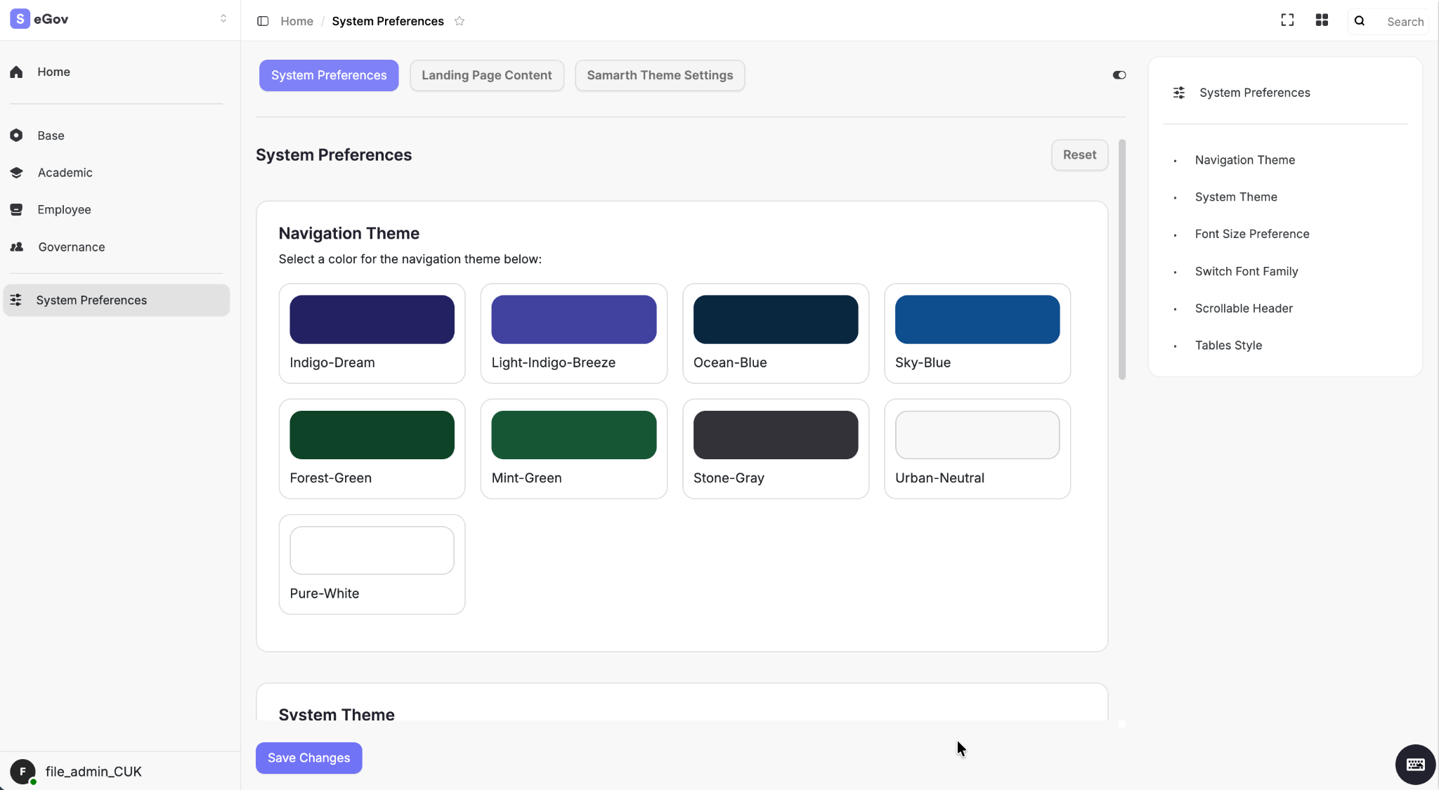
We are now effectively shipping a personal design system per user.
Options include:
- Navigation Theme:
- Colour palettes like Indigo Dream, Ocean Blue, Forest Green, Stone Gray, Urban Neutral, Pure White, etc.
- System Theme:
- Overall look: likely light/dark/neutral variants.
- Additional preferences:
- Font Size Preference.
- Font Family Switcher.
- Scrollable Header.
- Tables Style.
User guide:
- Navigate to System Preferences.
- Pick a navigation palette that matches your comfort (contrast, institution branding).
- Adjust font size if you prefer denser or more relaxed layouts.
- Experiment with header/table styles to tune readability for your workflows.
5. ii. Responsive & Adaptive Layout
/// Responsive & Adaptive Layout - Functional across almost every device
Almost every page and component patterns scales cleanly across the entire system, including mobile.
Key points:
- Core views render as simple, scannable lists on smaller screens.
- Full expandable mobile menu and user account dropdown in top menu bar.
- All the primary and secondary actions remain accessible via icons and contextual menus.
Expectation:
- Users can review and act on core tasks from mobile without needing the full desktop view in case of any emergency usage of the system.
6. System Feedback: Notifications & Offline State
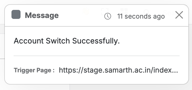
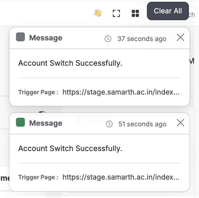
6. i. Notifications Style Alerts with Stack & Clear All Functionality
/// Notifications / Alert Toasts - stays across all pages until dismissed or until the browser cache is cleared.
/// Notifications Stack - Clear All in case of more than two notifications | reveals on hover of the stack
You’ve made transient toasts into a mini-event log.
Behaviour:
- Alerts (e.g. successful account switch, saved preferences) stay visible until dismissed.
- Hover or focus expands the full stack.
- “Clear All” removes all pending notifications and alerts.
Example messages:
- “Account Switch Successfully.”
- “System Preference saved successfully.”
- “Student record details have been updated successfully.”
- “Alumni has been successfully marked as Verified.”
Usage pattern:
- Glance at the stack when something feels off (“Did my action complete?").
- Use “Clear All” periodically to reset your context, please remember that once dismissed using the cross icon or Clear All button, the alerts will be cleared, even if you reset or clear the cache of your Samarth’s instance in your browser. And the same logic applies, if you switch browsers, you won’t be able to see the same alerts on different devices.
6. ii. Offline and Reconnection States
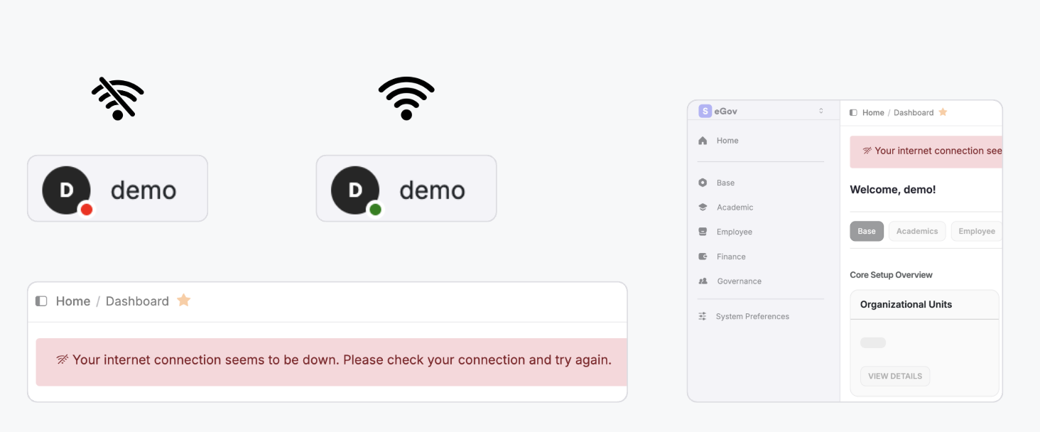
We’ve addressed one of the most ignored states in most ERPs.
What users see:
- Clear banner: “Your internet connection seems to be down. Please check your connection and try again.”
- Disabled links and actions while offline.
- Visual badge or dot indicating current connectivity state.
User Experience Outcome:
- No mysterious failures or empty attempts trying to edit or save a form when the network flaps.
- Users are explicitly told the system is fine, the network isn’t.
7. Integrated Guided Product Tour
/// Product Tour - Covers the entire design system of the new version
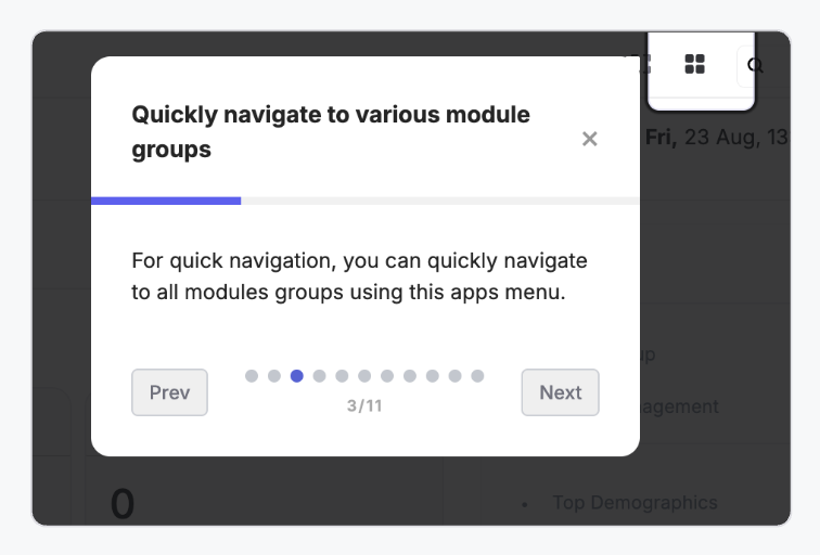
The expert guided tour that connects all these upgrades is demonstrated to the user by highlighting the different sections of the new version.
7. i. When and Where It Appears
- Appears as an overlay on top of the live interface when you first log in to the new version.
- Steps are numbered and track progress (e.g. 3/11).
- Can be controlled with Prev / Next, with a close (X) icon to dismiss the tour, and it will not return unless explicitly clicked on the tour guide button from the Homepage.
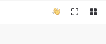
- You can resume the tour anytime from the Homepage using the helping waving hand icon at the top right corner.
7. ii. What It Covers
Tour Steps mostly include:
- New navigation and sidebars behaviour showcase.
- Package/module group switcher.
- Account type switcher.
- Spotlight Search and Bookmarks.
- App-specific sidebars with counters.
- Notifications stack.
- Offline state behaviour.
- System preferences (themes, fonts).
- Responsive behaviour / mobile recap.
- New login and error pages.
- Wrap-up and pointers to docs/help.
Each step:
- Highlights the relevant UI element.
- Uses a short, action-oriented description.
- Encourages users to try any new interactions from the latest features that have been shipped (e.g. “Resize the sidebar, etc.").
7. iii. How Existing Users Should Use It
- Do one full run after your system is upgraded to v4.0.
- Revisit if a feature feels unfamiliar (from the Tour Guide at any point from the Homepage).
- Treat it as a living “onboarding layer” rather than a one-time pop-up.
7. iv. Need to Switch Versions?
/// For a short while, ever feeling switching back to the previous version
- Check out the Version Preference page in the System Settings and quickly move back to the previous version, as mentioned earlier, this feature will stay for a short while only until all users are acquainted with the new design system.
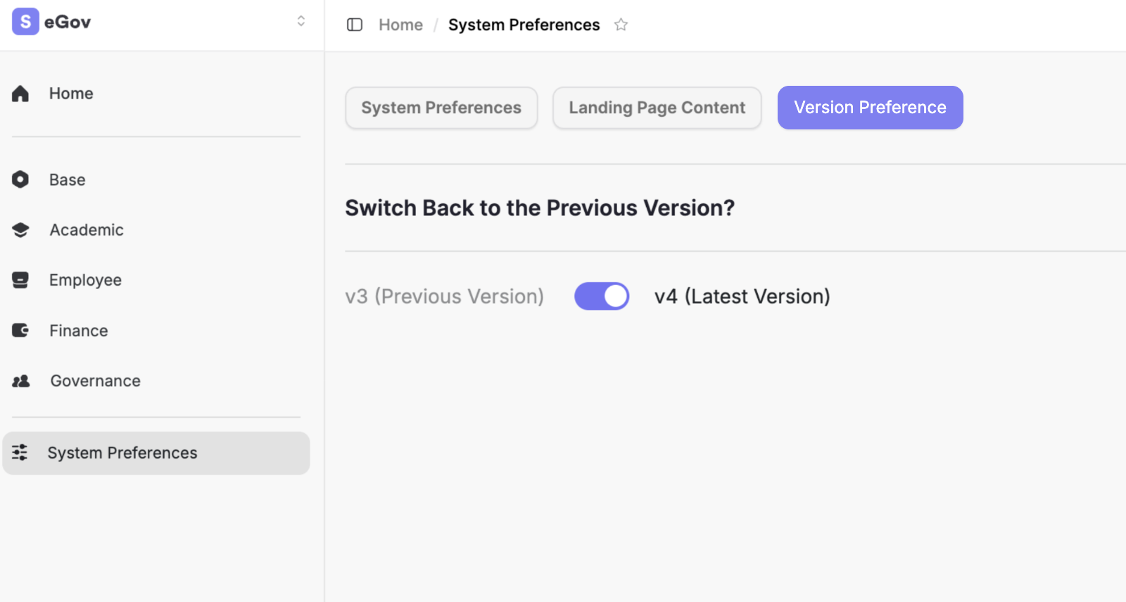
/// Want to get the latest version again?
- Just toggle the switch ⟡
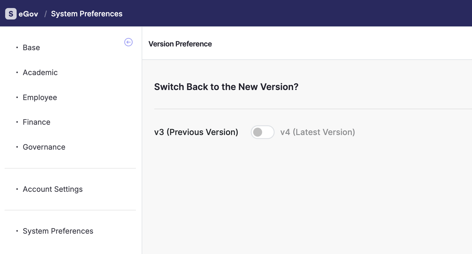
You can seamlessly switch between the Old Version and the New Version anytime from System Preferences.
If you temporarily prefer the previous version, simply toggle back to the Old Version for a familiar experience. This switching option is a temporary feature and will be removed after a while, once the New Version is fully adopted by all users.
8. “What’s New” Summary
Samarth eGov 4.0 introduces a redesigned experience centred on everyday productivity.
Users now get a spotlight-style search with bookmarks and recent pages, collapsible and resizable sidebars, app-specific menus with live counters, and quick switching between modules and accounts.
A fully customizable system theme, typography controls, and a responsive layout make the suite feel personal on both desktop and mobile.
Institutions benefit from richer, branded login and error pages, while users gain confidence through stacked notifications, robust offline-state handling, and an integrated guided product tour that walks them through every new capability in context.
Conclusion
// Feeling stuck anywhere?
Feel free to use the guided Product Tour anytime to get a hands-on experience of all the new features.
or
Contact your Institution’s Administrator or Nodal Officer to assist in providing a helping hand for using the system as per the new version.
Thank you for your time!
Designed & Engineered by Team Samarth
Last Updated:
February / 2026 — v4.0 Release